Wednesday, September 28, 2011

The Mill and the Cross and Bruegel's Road to Calvary

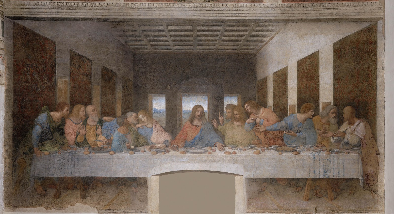
The extremely unique movie, The Mill and the Cross, by the filmmaker Lech Majewski  features Rutger Hauer as the Flemish Renaissance painter Pieter Bruegel the Elder.  If you are interested in the Northern Renaissance I would recommend seeing this movie.

This movie is visually stunning and takes the viewer inside the painting The Road to Calvary which was painted by Bruegel in 1564.  The painting, seen below, shows Christ carrying the cross on the way to his crucifixion in the center of the painting.  Instead of a quiet, solemn scene with just a few key biblical figures and a focus on Jesus, it has an almost festive atmosphere with about a hundred people.  Jesus carrying the Cross is nearly hidden in the center of the chaos and the Crucifixion appears to be set during the 16th century.  Let's first look at the painting and then I will discuss more about this movie.


The history of the region is important to keep in mind as you view both the painting and the movie.


The Road to Calvary, Pieter Bruegel the Elder, 1564
Kunsthistorisches Museum, Vienna

In the 15th century Flanders consisted of Belgium, the Netherlands, part of France and was ruled from Burgundy.  In the late 15th century Flanders was absorbed into the Hapsburg Empire, then King Charles V of Spain inherited it in the early 16th century.  After the Reformation of the Church the Flemish Netherlands became Protestant while Spain was staunchly Catholic.  This led to the 80 years war between Spain and the Netherlands with Flanders being ruled over by Spain.  Eventually the Netherlands won its independence in 1648.

In 1564 when Bruegel painted this work the Protestant Reformation had happened recently and Spanish soldiers were now occupying Flanders.  They are shown in red and on horseback in the painting.  It was not uncommon to set Biblical themes within the time of the painter, this had been done from Roger Campin to Raphael to Caravaggio.  This was in part due to a lack of knowledge of the architecture and dress of life in the time of Jesus and done unintentionally.  There were also many times when it was done intentionally, so that the churchgoers who were praying in front of the painting could better relate Christ to their own lives.

In the case of The Road to Calvary this can be seen as the latter, almost a warning to those who are fighting with each other in the name of religion.  Mixed in with scenes of the Passion of Christ are scenes of everyday life, life continues from dancing to fighting to selling wares to mourning the life of Jesus.  Above everything sits an imaginary steep and rocky hill topped by a windmill.  A windmill had four arms like the cross and was often a symbol for the cross, the windmill also seems a symbol for the ever present eye of God watching down on everyone.  This seems more like a festival such as in Bruegel’s many other works such as his Peasant Wedding, the artist was well known for his scenes of peasant life.


The Peasant Wedding, Pieter Bruegel the Elder, 1568
Kunsthistorisches Museum, Vienna

An important thing to keep in mind as well is the role of art in the church at this time, it was not meant to be decorative but to teach parishioners who may be illiterate.  Even for those who could read, paintings were a source for meditation and reflection. 

I saw the movie in that same sense.  Rather than an entertaining story it provided a similar role for the 21st century viewer that religious painting would have provided a 16th century viewer.  Majewski's film contained very little dialogue, no real plot and characters who were not fleshed out.  But the film is so visually stunning, so absorbing and engages the viewer in such a way as to transport you back to that time. It is obvious that a lot of work went into making this and creating every little detail that was shown.

While there isn't much dialogue, the movie is rich in sound: children playing, bells tolling, crows, crowds and the ever turning and grinding mill which more than ever is the symbol for God in this movie.  It is a composite between real and imaginary scenery, full of symbols.  I left thinking I would need to watch it again to fully understand it.  Charlotte Rampling played the mourning Madonna and had the most eloquent dialogue in the film.

Bruegel's wife seemed to symbolize a young Madonna, one of my friends who I saw it with noticed that a town magistrate seemed to symbolize Ponchos Pilate.

There are violent and brutal scenes, a man is killed and Christ is shown being crucified.  However that ties into the theme of the movie acting as a catalyst for reflection the way the painting would have.

Part of the description reads: "Majewski invites the viewer to live inside the aesthetic universe of the painting as we watch it being created." 

That statement for me sums the movie up best and has had me thinking about the painting and reflecting on life since I left.


Monday, September 26, 2011

The Last Supper as painted by Ghirlandaio, Leonardo and Tintoretto

The theme of Christ's Last Supper was a very popular image in Italian Renaissance painting.  Perhaps the most well known version is Leonardo da Vinci's fresco in Sta. Maria delle Grazie in Milan, but this scene has been well represented in art history.  The Last Supper (known in Italian as l'ultima cena or il cenacolo) was the last meal Christ shared with his twelve apostles before his Crucifixion.  


It was at this meal that Christ said "This is my body which is given for you" when he broke the bread to eat and "this is my blood" when he drank the wine.  These acts formed the basis for the Eucharist.  This is an important part of Christianity which is why it was depicted again and again in art.  Let's compare and contrast three different versions of The Last Supper as painted by Ghirlandaio, Leonardo and Tintoretto.

 The Last Supper, Domenico Ghirlandaio, San Marco, Florence, 1480's

You may remember from an earlier post that Michelangelo trained in the fresco workshop of Domenico Ghirlandaio.  The above Last Supper was painted as a fresco in San Marco in Florence, Ghirlandaio painted an almost identical version at the church of Ognissanti (All Saints) in Florence a few years prior.  This is a beautiful fresco and a good example of a standard type for this painting in quattrocento (15th century) Italian Renaissance painting.

The Last Supper was also the event where Christ announced that one of his twelve apostles would betray him, he didn't say who but any contemporary viewer would have known that was Judas.  Judas is always shown in these early Last Supper paintings as set apart from the rest of the group, here he is the only one present without a holy halo, sometimes his halo is shown as black.

This depiction was used so that the group of apostles would all be visible to the viewers and  that worshippers would easily be able to recognize the scene.  Symbols were commonly used in art and just as saints all had attributes in art, so did Judas.  His attribute early on was to be shown in a disgraced way.

Ghirlandaio (pronounced gear-land-eye-oh) has painted this scene using perspective and created depth in the painting with the tiles on the floor, incorporating painted architectural elements such as windows and arches, and by including a background of landscape with sky, clouds and birds.

He paints with his signature delicate and decorative style using bright light, soft colors, realistic faces and convincing figures.  At the time this and the other at Ognissanti were painted, they were considered some of the most beautiful Last Supper frescoes that had been painted.

The Last Supper, Leonardo da Vinci, Santa Maria delle Grazie, Milan, 1495-98 

However within ten to fifteen years later Leonardo da Vinci painted his fresco in the church of Santa Maria delle Grazie and this Last Supper was to become the definitive representation of this story.  This was also a fresco, but Leonardo used a new technique that didn't work well and began to disintegrate within his own lifetime.  As this wasn't done with standard fresco technique his colors are different and he was able to paint with more detail, however much of the original detail has worn away.

Leonardo used a startling and bold new type of composition, done in a much more realistic style than that of his predecessors.  Here he doesn't just show the event of the Last Supper but a specific moment, that in which Christ has just announced that one of his apostles will betray him.  All at once they begin to ask "Is it I my Lord?  Will it be I?" 

Jesus is the central point of perspective in this rendition, all the lines used in the architecture to create depth can be traced back to him.  Jesus is completely still and calm and all movement and shapes radiate outward from him.  In this painting Judas sits with everyone and has just knocked over the salt.  Leonardo also uses symbolic representation in this painting, I have mentioned in previous posts that three was a divine number and four was the number of man.  Here he separates the apostles into four groups of three, symbolically calling attention to the fact that Christ was the one who joined mankind with divinity through his Crucifixion.

I have always found this to be a powerful piece and have only seen representations of it.  When I have seen Leonardo's paintings in person I have felt like they eclipse everything else in the room and seem to glow with a heavenly light all their own.  The Last Supper in Milan is something that I very much look forward to seeing in person someday as I get the same sense of that from just seeing pictures in books or slides in lectures.

With Leonardo's new depiction the Last Supper was transformed in painting into a stronger and more realistic scene.
  
 The Last Supper, Tintoretto, San Giorgio Maggiore, Venice, 1592-94

For our last painting to compare and contrast let's jump ahead 100 years later to the Late Venetian Renaissance.  The damp, humid climate in Venice didn't work as well for fresco painting where pigments where mixed directly into wet plaster.  At this time artists used oil on canvas and due to this different medium were able to get different results from Florentine frescoes.

Tintoretto was known for his dynamic style, broad and painterly brushwork and bold highlights painted on a dark ground.  Rather than using the early perfectly proportioned and symmetrical compositions of the High Renaissance, he used energetic and dramatic compositions.

We can see that here in this later Last Supper that uses a diagonal dinner table to create depth and drama in the painting.  Angels and servants join the others in this painting, however Tintoretto does go back to the earlier depiction of having Judas sit on the opposite side of the table and the only apostle without a halo.  His Christ is shown breaking the bread, and as in Leonardo's work Christ seems to be a calm center from which all action emanates.

The Last Supper was painted literally hundreds of times throughout art history, these three artists and styles were important and had a large influence on many of the depictions that followed. 

Sunday, September 25, 2011

Titian's Entombment of Christ

Titian (Tiziano Vecellio) was undisputedly one of the great masters of the Venetian Italian Renaissance in the 16th century.  He studied under two other great masters: Bellini and Giorgione, and built on the skills he learned to become the most influential painter to come out of the Venetian school.  Titian became the official painter of the Venetian Republic in 1516.


 The Entombment of Christ, Titian, The Louvre, 1523-26

One of Titian's most significant contributions to painting was his style of brushwork.  Titian broke from the tradition of meticulously painting every minute detail from life, instead using expressive bold strokes and dots of color to create illusions, which captured reality.  His technique revolutionized painting in the 16th century.  Another thing he was known for were his sophisticated mathematical compositions within his works, breaking from earlier more symmetrical paintings.

The Entombment of Christ was a work which embodied the new harmony of the Renaissance.  In this composition the figures are placed with a mathematical precision forming two isosceles triangles within the painting.  The curving shapes of several others then enhance these triangular shapes. This emphasizes the harmonious proportions that were used in ancient Greek art and revived in the Renaissance.  His use of mathematics within the work draws the eye of the viewer into the action taking place. 

 Death of Meleager, Roman sarcophagus lid, marble, The Louvre, c-180 AD
photo- © user Mbzt / public domain, via Wikimedia Commons

The Entombment of Christ is a relatively early work in Titian's sixty-eight year career as an artist.  Frederick Hartt in his History of Italian Renaissance Art wrote of this work:

            "The pose of Christ is borrowed from that of the dead Meleager carried from
            the boar hunt in a well-known group of Roman sarcophagus reliefs."*


I am not certain if the example of the Roman sarcophagus from the Louvre (shown above) is the specific work that influenced Titian.  Even if it was not, it does help illustrate the idea of placing figures within a composition using mathematical arrangement which was common in antiquity.

Pesaro Madonna, Titian, Sta. Maria Gloriosa dei Frari, 1519-26

Another early example of this type of composition can be seen in the Pesaro Madonna, shown above.  This work also breaks from the perfect symmetry of the High Renaissance to give us a new type of interesting arrangement of form.  Again the various sets of figures are arranged in a triangular form.


As I stated in my blog post on Chartres Cathedral, the triangle was the number of divinity.  This can be seen in the Trinity and in Christian art and architecture is repeated many times over: the trefoil in Gothic architecture, tripartite naves, figures grouped into three, etc.


The Pesaro Madonna (so named as it was commissioned for the Pesaro family) rearragnes the standard frontal Madonna and Child portrait so as better to create depth, move the viewers eye through the painting and pull the viewer into this divine space.  In this Titian uses his trademark brushwork and coloring.

These are just two examples of painting from Titian who created hundreds throughout his long painting career.  He was nearly 90 when he died and continued to use the triangle in his compositions up until his final painting of the Pieta which he began for his own tomb.


*Hartt, Frederick. History of Italian Renaissance Art. 4th edition, New York: Harry N. Abrams Inc. Publishers, 1994. p. 591.

Tuesday, September 20, 2011

Jean François Millet's The Gleaners

 Jean François Millet grew up in a poor farming family on the coast of Normandy.  Despite his humble upbringing, Millet was very well educated in both art and literature and decided to move to Paris in 1837 to further his studies in art.  Due to his social standing he was not well received at the Ecole des Beaux Arts, instead he joined the studio of a minor master painter, Paul Delaroche.  Millet's personal experience contributed to his painting style and he never forgot his background.   

Millet's talent as a painter was evident and he started receiving critical acclaim in the early 1840's. However, Millet spent much of his life in poverty and continued to struggle despite his successes.  


The Gleaners, Jean François Millet, the Louvre, 1857

He preferred to live in the countryside rather than Paris, he moved to Barbizon in 1849 and remained there for the rest of his life.  Millet's style is considered that of the Barbizon School of painters who painted from life and from nature and embraced a new type of realism.  Millet was not interested in either the popular Neoclassical or Romantic styles of painting; instead he painted what he knew: farmers and peasants performing their daily tasks of work.  

That style is evident in works such as The Gleaners, which was exhibited in the annual Salon of 1857.  What we are seeing is a depiction of the lowest type of peasants, those who gather the scraps of hay after the harvest has taken place.  The woman are hunched over, their lives are so connected with the earth that none of their heads are placed above the horizon line.  However they are shown in a warm glowing light, set apart from the neutral background by wearing muted primary colors.  Their proportions and placement in this painting add to the feeling that these women, who were on the bottom of the socioeconomic scale work hard enough to be considered the equivalents of any figure to be featured in painting.  
 
Peasant life had been depicted since the Baroque but not in the same manner as Millet.  Earlier paintings of peasants showed a rowdy bunch of characters, peasants as an allegory or an overly romanticized view of life.  Millet broke new ground by portraying his realistic figures with a quiet grace and dignity that had only been shown before in subject matter such as mythic heroes and royalty. 


Thursday, September 15, 2011

Doric, Ionic and Corinthian

When the Ancient Greeks constructed temples thousands of years ago, they were very precise in their layouts and measurements for every aspect of these buildings.  There were three main architectural "orders" known as: Doric, Ionic and Corinthian.  The differences in the styles are most easily recognized in the column capitals (the decoration on top of the columns) and have been used in architecture ever since.  

Which style is which and what are the differences between them?

The Doric Order
Our first example, Doric can be seen by looking at the two examples below: to the left the Temple of Hephaestus in Athens and to the right a diagram of the Doric Order.  The Doric Order was the first to be introduced, the column capital is plain and undecorated and the column itself is fluted and there is no base to the columns which grew slightly larger in circumference as they neared the base.  The Doric order also included a specific "entablature" or decoration above the columns.  Alternating "triglyphs" and "metopes" around the frieze at the top and sat on top of a plain band known as the "architrave" where the column would meet the frieze.

Triglyphs had three raised bars (tri=three) which separated each sculptural scene, those were known as metopes (met-oh-pee).  The simplicity of this style was very popular in the Archaic Period in Greece (750-480 BC) and seemed to be more popular on the mainland than on the Greek islands.  The Doric Order was imposing and massive in their appearance and elements of this continued to influence through the ages.


Temple of Hephaestus in Athens, Greece, 449-415 BC
photo- © Sharon Mollerus / public domain, via Wikimedia Commons


Here is a more recent example of an adaption of the Doric Order, the Tempietto designed by Bramante in Rome at the start of the 16th century during the High Renaissance.  Bramante was also responsible for being one of the principle architects of St. Peter's in Rome.


Note that while Bramante used the classic Doric column capital, he broke from the Ancient Greek tradition by using smooth columns instead of fluted columns and he added bases to the columns which the traditional Doric did not use.  Another Renaissance invention was using a different color of marble for the column and capitals.  However Bramante did include the full entablature of the Classical Doric Order: an architrave (plain band above the columns) and triglyphs (three raised bars) alternating with metopes (sculptural decoration).


Tempietto, Donato Bramante, San Pietro in Montorio, Rome, c-1502


The Ionic Order
The second style that was invented was known as Ionic and can be most easily recognized by the scrolled capital on top of the columns.  This style was also created in the Archaic period and was used more frequently on the Aegean Islands than on the Greek mainland.


Besides the scrolled capital which is its most recognizable feature, the fluted columns are thinner and sit on a base.  The triglyphs and metopes are replaced by a plain, undecorated frieze.


Column of the Erechtheion, Acropolis of Athens, 421-406 BC
photo- © Guillaume Piolle / public domain, via Wikimedia Commons


A beautiful Renaissance example can be seen in La Rotunda (Villa Capra) which was designed by Palladio in Vicenza in the middle of the 16th century.  Palladian architecture had an enormous influence on both Renaissance and later architecture.  Palladio was very aware the the proportions and harmony that were used to create the original Greek temples.


Here is a detail of one of four symmetrical porches, again the one change that Palladio made was to use smooth columns instead of fluted columns.  La Rotunda the influence behind the American president Thomas Jefferson's home of Monticello in Virginia.  However Monticello used the Doric Order on its porches.


Porch of the Villa Capra (La Rotunda), Andrea Palladio, Vicenza, began 1567


The Corinthian Order
The Corinthian Order was the latest order to be introduced, the earliest example was found during the Late Classical Period (430-323 BC) but it was the style favored by the Romans in their architecture.  The Corinthian order used a column topped with an ornate capital with acanthus leaves and small scrolls.  The rest of the Corinthian order was the same as the Ionic order: the column sat on a base and there was a plain frieze instead of the trygliph and metope pattern used in Doric.

From A. Rosengarten, A Handbook of Architectural Styles,1898
    The Pantheon in Rome, 126 AD


A very good example of this can be seen in the Roman Pantheon designed in 126 AD.  While earlier Greek Corinthian columns were fluted, some later buildings such as the Pantheon were not.  There are more examples of the Corinthian Order in architecture because the Romans preferred this style and used it frequently throughout the Roman empire.

Another Palladian example can be seen below in the beautiful gleaming white marble facade of San Giorgio Maggiore in Venice.  We can instantly see the ornate column capital consisting of small scrolls and curling acanthus leaves.

San Giorgio Maggiore, Andrea Palladio, Venice, 1566-1610

While there have been variations from the original Greek orders throughout the ages, even the Romans created variations.  Greek columns were freestanding and used for structural support but the Romans often used columns for decorative purposes.  

Look at the Colosseum, below.  Greek temples were built using only one order but the three bands of decorative columns are each topped with a different column capital.  Without looking can you identify each of the three?


Exterior of the Colosseum, Rome, 72-80 AD
photo- © Paul Zangaro / public domain, via Wikimedia Commons

Remember that Doric has a plain capital, Ionic a scroll and Corinthian an elaborate one topped with leaves and small scrolls.  Therefore from the bottom up are Doric, Ionic and Corinthian.

 Variation on the three Greek orders: Doric, Ionic and Corinthian can be found everywhere.  They were used in the Renaissance, the Baroque and the Neoclassical styles of the 18th century as well as various revivals in the 19th and 20th century.  They are still in use today from public buildings to private homes and my blog readers are likely to spot them soon.  Next time you see a column that was created in the Greco-Roman style (or an original) you can ask yourself- Is it Doric, Ionic or Corinthian and I am sure you will know.  


Sunday, September 11, 2011

Chartres Cathedral's North Rose window

To a modern viewer Medieval stained glass windows are a beautiful aspect of churches but to the Medieval viewer, stained glass windows were like books in Gothic Cathedrals, each pane told a story and each window was like a book of stories, usually pertaining to the bible.  Though there were also often references to history, past and current rulers, saints, the seasons or local stories as well.


Rose windows in cathedrals were beautiful examples of this.  These were called rose windows as the panes of glass radiated outwards in a circular pattern like a rose, rose windows are found in most Gothic Cathedrals.  Several years ago I was fortunate enough to visit the beautiful Notre Dame Cathedral in Chartres, which is in central France and had a tour by renowned Gothic scholar Malcolm Miller.  Each tour he gives focuses on a different part of the cathedral and tour I went on focused on both the Northern Rose Window and the North Porch which is on the exterior side of the cathedral.  Both had a very similar iconography; that of the prophets telling of the birth of Christ, and of Mary.


North Rose Window at Notre Dame Cathedral, Chartres, France, c-1235
photo- © Guillaume Piolle / public domain, via Wikimedia Commons
 
In the very center of the window the Virgin Mary holds the baby Jesus  She is surrounded immediately by doves and angels.  The 12 major prophets encircle them in diamond shaped windows.  Then there are 12 quatrefoil (4 1/2 circles) windows with the symbol of France the fleur-de-lis.  The fleur-de-lis is literally "the lily flower" the flower that the Virgin Mary is always seen holding in an Annunciation scene.  The lily was for centuries a symbol used to indicate purity and the deep color blue is the color of the Mary and also a symbol for purity.

The exterior half lunette shapes each contain one of the minor prophets.  The small lancet (long, thin windows) windows at either side of the main rose window would indicate who the patron was, in this case Queen Blanche of Castille who was originally from the Castillian region of Spain before marrying into the French royal family and becoming the mother of St. Louis.  She ruled at the regent of France from 1226-1236.  The fleur-de-lis being the symbol of France and the gold castle on a red background being the symbol of Castille.  Anyone seeing this would have recognized right away that these were the joint symbols of Blanche of Castille.


North Rose Window, detail of center, Chartres, France, c-1235
photo- ©  Mossot / public domain, via Wikimedia Commons

It is important to keep in mind when viewing medieval art that as much of the population was illiterate, there was a greater significance placed on symbols.  Specific numbers, colors and objects all told stories to the viewer.  When we look at this Rose window we notice that we have five concentric circles which all contain 12 small windows: the center has 12 small circles, then 12 windows radiate out from that, there are 12 diamond shapes, 12 quatrefoil shapes and finally 12 half lunettes.

Everything is planned in medieval art, the number 12 was important for several reasons.  Three was of course the number of the trinity and four was the number of man.  Man had four limbs, life cycles and seasons. The Cross on which Christ was crucified also had four arms.  Therefore 12 (3 x 4) was a joining of the divine with mankind, which is also why the number 7 (3 + 4) was important symbolically.  Each color was significant as well, as mentioned earlier blue was a symbol of the Virgin, also red was a symbol for the Blood and Passion of Christ.

King David, St. Anne with the young Virgin and King Solomon
North Rose Window, detail of lower lancets, Chartres, France, c-1235
photo- © Amanda Harmonia/ public domain, via Wikimedia Commons

Below the rose there are five larger lancet windows showing from left to right: King Melchizedek, King David, St. Anne with the young Virgin, King Solomon and Aaron.  Each of the four Old Testament figures is on top of a heretical figure such as King Saul committing suicide or Jeoboam praying to golden idols of calves.

The cathedral has three rose windows and nearly two hundred other stained glass windows, most made in the early 13th century by artists whose names are lost to us.   However the beauty and messages of these windows live on.

North Rose Window, detail, Chartres, France, c-1235
photo- © Amanda Harmonia/ public domain, via Wikimedia Commons

 Note: Malcolm Miller has also written several books on Chartres Cathedral.  I bought one while I was there but you can also find them online, they are published by Pitkin Guides

If you visit make sure to go on one of the twice daily tours he offers.

Thursday, September 8, 2011

The Colour of My Dreams: The Surrealist Revolution in Art

I recently visited Vancouver, B.C. where I saw the exhibit The Colour of My Dreams: The Surrealist Revolution in Art at the Vancouver Art Gallery.  It is a huge show and if you haven't seen it yet you have until the end of the month, it ends on Sunday, October 2.  There are hundreds of artworks by 80 artists in a wide variety of media.  If you are interested in Modern Art I definitely recommend this exhibit.

I am interested in all of the meanings behind Surrealism and know I have a lot to learn.  The exhibit is huge and brings Surrealist work together and borrows from dozens of museums and private collections. 
René Magritte, The Six Elements, 1929, oil on canvas
Philadelphia Museum of Art: The Louise and Walter Arensberg Collection, 1950
© Estate of René Magritte / SODRAC (2010)

There are paintings, videos, drawings (including several "exquisite corpse drawings") and sculptures.  The sculpture also includes many works from Canada's First Nations (known in America as Native Americans) which had a strong influence on Surrealism.  I hadn't realized this earlier but seeing the side by side comparison gave me a new appreciation for both types of art. 

Surrealism began in Europe in the 20's and the movement was influenced by a variety of things including-
-The studies of Freud and new ideas about psychoanalysis as well as dream analysis.
-The art of the Dada artists a decade earlier who used art to make sense or World War I (or use their "nonsense art" to show that the war didn't make sense).
-The Metaphysical art movement also about a decade earlier which was the first to explore the ideas of the unconscious.
-The idea that tapping into the unconscious and letting go of rational thought completely frees ones creativity.
        Joan Miró, Photo: This is the Colour of My Dreams, 1925, oil on canvas
The Metropolitan Museum of Art, The Pierre and Maria-Gaetana Matisse Collection, 2002
© Successió Miró/SODRAC (2011)
Image © The Metropolitan Museum of Art/Art Resource, NY

I will fully admit that I am not expert on the period, I have mostly been researching pre-20th century art.  However I have always found it fascinating, ever since I saw the work of Rene Magritte as a child.  A year ago I saw an amazing exhibit of Metaphysical art in Florence and this past spring my interest was renewed when I visited the Magritte Museum in Brussels.

Surrealism didn't have one specific style but most artists were interested in either creating very realistic works that didn't make visual sense (such as Magritte) or in creating works that were done when they let go of a rational thought process (such as Miro).  One example of the latter is the painting above by Miro which gave the exhibit its name.

Max Ernst, The Forest, 1923, oil on canvas
Philadelphia Museum of Art: The Louise and Walter Arensberg Collection, 1950
© Estate of Max Ernst / SODRAC (2010)

Rather than being arranged chronologically, the curators divided the art work into several categories.  Some of those categories were "Spaces of the Unconsious", "Forests/Labyrinths", "Exquisite Corpse", "Myths, Maps, Magic" and "Anatomies of Desire" each highlighting a different aspect of Surrealism.

Both forests and labyrinths were aspects of the human psyche, forests were thought of as dark and foreboding and could be interpreted as the darker part of human nature.  Labyrinths were confusing places where people lost reason.  The Surrealists had a journal titled "Minotaur" after the Minotaur that was in the labyrinth of Greek Mythology.

Pietà or Revolution by Night, Max Ernst, 1923, oil on canvas
Tate Modern, Purchased 1981, © Estate of Max Ernst/SODRAC (2011)
Photo: Tate, London/Art Resource, NY


The "exquisite corpse" were group drawings where a folded piece of paper each had an artist add an element of a figure to it.  It is the visual equivalent of having everyone add a line to a story without seeing the line preceding it.  The results were interesting and usually pretty amusing in a creative way.

Myths, Maps, Magic highlighted the influence of the Canadian First Nations upon Surrealism.  There was a beautiful example from the Kwakwaka’wak tribe of a peace dance headdress made of maple, abalone, paint, cloth, ermine fur and sea lion whiskers which is part of the permanent collection of the Vancouver Art Gallery.

I came away with a better understanding and appreciation for Surrealism, as well as a sense that I want to learn morn about this art movement.  The Surrealists have provided inspiration for generations of Modern and Contemporary artists.

I think everyone will want to see this show, but if you do miss it there is a very good exhibit catalog which accompanies it: 

Monday, September 5, 2011

Recommendations on Purchasing Music Supplies

Buying the right music supplies can be challenging. The number of music gear on the market can be overwhelming and difficult to go through. Especially for first timers, it is hard to evaluate which brands and models will give the right sound quality. You may find it difficult to differentiate the slightest discrepancies in sound quality.

Here are some pointers to help you avoid problems when buying music equipment.

Do Not Rush

You may never find the right things if you make hasty decisions. Refrain from making mistakes and take your time before you actually invest in a range of music supplies. Finding the right music equipment is important because you will use these for years to come. Likewise, they also come expensive. You cannot constantly splurge on music equipment to trade what you wrong for new ones.

Investing more time guarantees finding the appropriate items. Researching for all possible options increases your chances of buying products satisfying you for a long time. It is an old shopping cliché that when impulsiveness strikes, you likely regret your purchase in the end. Do not make the same mistake with something as expensive as music devices. Take your time. Do your homework and look for as many suppliers and products as you can. This will save you from future grief.

Know What You Need

From stage monitors to composition software, music equipment does not come in one-size fits all. Music devices have their specific use and outcome. If you want to produce a certain sound quality, you have to buy accurate equipment. For simple house recording, you can skip 24-track recording program and stick to less advanced products. Nonetheless, for local band recordings and similar projects, go beyond the 8-channel interface. You will simply outgrow the equipment putting your money to waste.

Check if your computer can accommodate the software you want. You may need to buy computer hardware to make your program work. Ask the following things when deciding on what you need:

- Is the amp sufficient for your prefer range of tone and music? Is it sufficient for what clients want?
- Do you want a flexible virtual instrument rig or stable keyboard workstation?

As much as possible, you should figure out your present and future needs before searching for music equipment. This will take you far in your music investment.

Differentiate Important Features

Manufacturers usually highlight impressive specs. Do not fall for what they put out as amazing features. Most of the time, it is not about the specs. Research about music device functions important for producing sound qualities. Focus more on the functionalities of equipment than on additional features. This saves you from paying for something you do not need.

Saturday, September 3, 2011

The Arnolfini Wedding Portrait

There have been so many things written about the very well known Arnolfini Wedding Portrait done by Jan van Eyck in 1434 that I hope I can add something new.  At the same time I hope I can fit everything I want to say in just one blog post, this work is filled with meaning and it is a fascinating double portrait.

This was painted in Bruges by the Flemish artist van Eyck and showed a wealthy Italian patron who was originally from Lucca in Tuscany.  There was quite a lot of trade and influence between Tuscany and Flanders as Tuscany was known for its wool and wool cloth and Flanders for its tapestries.  Arnolfini had been living in Bruges for years.  It is a sign of his wealth and prestige to have commissioned a painting done by one of the highly sought after Flemish masters such as van Eyck.

Arnolfini Wedding Portrait, Jan van Eyck, 1434, The National Gallery (London)

In my very first blog post I cautioned modern viewers not to judge a painting by its title which can often be misleading.  The first reaction of many viewers when they see this is, "This is a wedding portrait? But she is very pregnant!" 


We should look at this instead as a portrait which commemorated the wedding between the Italian merchant Giovanni di Nicolao Arnolfini and his wife (whose identity in this painting is uncertain).  This could have been painted after her death (Arnolfini's first wife died in 1433 and there was no documented 2nd wedding), painted after the wedding, or even painted before a 2nd wedding took place.


When looking at this and other paintings from this time period the modern viewer needs to keep in mind that the standards of beauty in 15th century Flanders differ considerably from those in the late 20th/early 21st century.  At a time when so many people were very thin due to poverty, a plump figure was considered more attractive.  Also at a time when infant mortality rates were quite high, women would pad their stomachs to look pregnant as it was desirable to be so.  That was a sign of wealth, youth and fertility.  Look closely at the detail of the figures (below), the bride is actually holding a large piece of the fabric of her dress to her waist.

Arnolfini Wedding Portrait, detail of the figures, van Eyck, 1434

Therefore it is unknown if the woman was pregnant at all but was just trying to look like she was or to indicate that she was fertile and that the marriage would produce numerous children.  Or if it was an unintended side effect of holding her dress up which would have been necessary for her to walk.

Another fashion from the time was for a woman to pluck her hairline very far back, we can see that she has done this as well.  It was considered very elegant to have an extremely high forehead.

One reason that this has either been thought to be a memorial portrait or a portrait of a woman who Arnolfini is engaged to but hasn't met yet is her lack of specific features.  Versions of the same sweetly precious face can be seen in several of van Eyck's angels.  She looks rather stylized, like the idea of a beautiful woman rather than a specific person.  In the case of the former there wouldn't have been a record of her appearance and in the case of the latter it was not uncommon for marriages to be arranged.

However the features of Giovanni Arnolfini's face are very pronounced, compare his portrait with the one below.  This was also done by van Eyck and more than likely shows the same man, or another member of the wealthy Arnolfini family.

Portrait of a Man (possibly Giovanni Arnolfini) van Eyck, 

 Arnolfini Wedding Portrait, detail of the dog and shoes, van Eyck, 1434

As was typical in paintings done at this time, the work is filled with symbols for the viewer.  The dog was a symbol of the fidelity of the marriage, and the shoes were removed as a sign of respect.  In fact shoes are often removed in Flemish paintings, the same thing can be seen in the Portinari Altarpiece, that I recently wrote about (if you look at that also note the high hairlines of the female saints as well).

Arnolfini Wedding Portrait, detail of the mirror, van Eyck, 1434

This painting isn't very large, (32.4 in × 23.6 in),  I have seen it in person at The National Gallery in London and some of the details can only be seen with a magnifying glass.  One example is the convex mirror on the back wall.  The mirror and the fact that two other people are entering the room can easily be seen.  There are ten small circular pictures embedded in the mirror that show scenes from the Passion of Christ which are very difficult to see with the naked eye.

Quite possibly the artist was using a type of magnifying glass in order to paint these small roundels and other very small and specific details.

Who were the two people in the mirror? It has been thought that one was the artist, or instead that it shows two witnesses to the actual marriage.  Were they instead figures who would have only been present in spirit such as patron saints or ancestors?  This has remained a mystery.

Arnolfini Wedding Portrait, detail of the window, van Eyck, 1434

The oranges which can be seen near the window were a subtle symbol of wealth, this is because they were not native to the region and would have been imported from a warmer climate.  Only the wealthy would have had oranges on hand.

Other symbols of wealth were the outfits that are worn, long and trimmed with fur, and the rich and vibrant pigments used to paint them.  The rich reds, blues and greens could only be achieved when semi precious imported stones were ground up and added to the paint to get such lustrous colors.


 Arnolfini Wedding Portrait, detail of the chandelier, van Eyck, 1434   

Lastly we will look at the signature and the chandelier.  This was painted at a time when not all artists signed their works, but here van Eyck has signed his name with a flourish.  He uses a formal calligraphy and writes "Jan van Eyck was Here" and adds the date as well.  One reason in fact that he is thought to be one of the figures in the mirror is how this is written.  Take note of St. Margaret, who is always shown trampling a dragon (as can also be seen in the wing of the Portinari altarpiece).  There is a figure of her on the bedpost though I am not certain of her significance in this scene.

The chandelier is a very interesting feature of the painting, it only has one lit candle, a reference to the ever present eye of God. The artist was carefully observing the laws of perspective when he painted this and the details on each elaborate arm.
There are still so many other objects and symbols in this work- the bed (referring to the marriage), the broom (the domestic realm), the cherry tree seen through the window (this is either a spring marriage or a reference to fruitfulness), the rosary (showing the sanctity of marriage).  Even the placement of the figures has a symbolism, the wife stands in the half near the interior which was her realm and Arnolfini stands closer to the window and outside since his realm was his business outside the home.

I really find this painting endlessly fascinating and judging by all that has been written on it I am not alone.


Thursday, September 1, 2011

Hubert Robert's View of the Port of Ripetta in Rome

French painter Hubert Robert was born in 1733 and spent most of his life in Paris, however he was enrolled at the French Academy in Rome.  Robert spent a total of eleven years in Rome; it was there that he befriended Giovanni Battista Piranesi, whose workshop was located near the Academy.  The two artists would often go outside to sketch together; both men shared a love of ancient Rome and were drawn to the ruins.  During the years that Robert was in Rome he made hundreds of sketches filling several notebooks,
 Architectural Capriccio with Figure among Roman Ruins, Pannini, c-1630

He also befriended Giovanni Paolo Pannini while studying at the French Academy; Pannini was the professor of perspective .  Robert ended up working in his studio and Pannini became the biggest influence on his artistic style.  Pannini took on the role of a mentor for Robert and the younger artist proclaimed him to be the greatest painter of ruins in the world.  Pannini frequently painted fictitious cityscapes of Rome or “capriccios” which showed a variety of famous ruins grouped together in one spot, these paintings became popular with patrons on The Grand Tour of Italy.

Robert applied to be a member of the French Royal Academy in Paris and was accepted based on his 1766 painting View of the Port of Ripetta in Rome, which was exhibited in the Salon of 1767.  Robert’s painting is a unique style of capriccio, he is “redesigning Rome” by creating a scene pieced together from actual monuments both ancient and modern.  Rather than grouping together buildings to make a tourist capriccio in the style of Pannini, he dramatically changes the urban landscape.  The influence of both Piranesi and Pannini is evident, but with this painting Robert created a style all his own.  

View of the Port of Ripetta in Rome, Hubert Robert, 1766

The Port of Ripetta did exist in another fashion during the time that Robert lived in Rome.  The port was built in 1703 under the rule of Pope Clement XI and was designed by the architect Alessandro Specchi.  An accurate view of the port can be seen in an engraving by Piranesi which was done in 1753 (not shown here).  The port was built on top of a steep muddy bank (the very word Ripetta means little bank) which was already being used for the unloading of small commercial ships traveling to Rome down the Tiber River.  At its height the Port of Ripetta was quite busy but did not last very long; its usage and popularity had already waned by the later part of the eighteenth century.  By the time of the unification of Italy, river trade had declined and Rome’s population was growing, therefore there was a greater need for additional bridges to span the Tiber.  The port was completely dismantled in 1889, less than 200 years after it was built, today one end of the Ponte Cavour sits in its place and a piazza bearing its name is located nearby.  

In visually analyzing the work the viewer will notice that Robert has combined the architectural styles of several time periods in his view including ancient (the Pantheon), Renaissance (the Palazzo dei Conservatori from the Campidoglio to our left) and modern (the Port of Ripetta created only fifty years prior).  The city of Rome of course has combinations of architectural styles everywhere, but in Robert’s work the way they complement each other makes them appear to all have been planned at the same time.

Also notice that Robert has turned the port itself into a ruin with crumbling steps and the marble wearing off of the high harbor wall to reveal the bricks underneath much like the current condition of the Pantheon.  In this detail he seems to suggest that they were built at the same time.  The two architectural spaces seem to fit together nicely, the rounded wall complementing the cylindrical shape of the Pantheon.  Robert may also have done this to comment on the materials used to build the steps.  While most of the stone used for the steps was newly quarried, parts of it were quarried from both the Forum ruins and from the Coliseum and this fact was well known.  The Pantheon sits on flat ground and is today hidden from sight from a distance by other buildings, unlike the Coliseum.  Robert seeks to give the Pantheon a more prominent spot in the city which is fit for its majestic appearance.  By putting the viewpoint near the bottom of the picture we get an increased sense of the grandeur of this monument.
 The Pantheon in Rome, built in 126 AD

What is interesting is that in this work his main architectural feature is a monument which combines pagan and Christian meaning.  The Pantheon was a Roman temple for all the gods currently used as a church.  This unique work nearly gave Robert an opportunity to act as an architect, this redesign of an urban space hints at his later interest in architectural work such as in assisting with the design of the Grand Gallery of the Louvre.  This interest can be seen throughout Robert’s career and his studies at the Academy.  In his sketchbook from 1760 he has already created several small pen and ink wash capricci.  His interest in reviving ancient architectural proportions and in combining Christian and ancient symbolism are evident even then.   

Who did Robert have in mind as a viewer for his Roman capricci?  Possibly he imagined the viewer as someone who preferred to look back on a view that symbolized Rome rather than one that documented it.  There were also political associations with the symbolism of ruins which may have contributed to patronage.  In the eighteenth century Rome and ruins were tied in with the idea of Neoclassical art which became popular after the excavations at Pompeii.  Neoclassicism in later eighteenth century French painting represented the ending of the Bourbon monarchy, using classical imagery to symbolize the pre-imperial Roman republic in calling for France to reject the monarchy and form its own republic.  

Robert’s work can be viewed with multiple significances.  His architectural spaces combine the sense of proportion from both the ancient world and the late Baroque time in which he lives.  His use of architecture both adds to a romantic view of a classical world and can also be seen as a link between the knowledge of the past and the ties to the papal and possibly Bourbon rule of the present.

Imaginary View of the Grand Gallery of the Louvre in Ruins, Hubert Robert, 1796, Louvre

The use of ruins in Robert’s work can be seen to represent the constancy of man rather than to be used as symbols of destruction and decay.  The use of multiple figures at work or at play in his ruin paintings illustrate how mankind continues to participate with one another throughout the centuries.  That same concept led him to paint one of his more well known works while he was redesigning the Louvre to be a public art museum after the French Revolution, Imaginary View of the Grand Gallery of the Louvre in Ruins.  In this work he imagines this building in the future, and the cycle of tourists and ruins continuing indefinitely. 


Popular Posts

Blog Archive